The Bureau Of Meteorology is Australia’s weather service, colloquially referred to as “BoM” and a moniker they’ve accepted so well that they reach out to media outlets confirming that’s how they want to be referred in order to prevent confusion. Which is really good for a government department rather than doing something dorky like a divorced mid-40’s housemate who demands people call him “Diesel”, a terrible moniker he gave himself and then nicking a pineapple from your wallet to post an ad telling everyone that’s his nickname.
They provide all the usual stuff layfolk would expect from a weather service: forecast, observations, warnings, and cool rain radars so you can see if the rains are ‘ere. This last part is the focus of this blog, because the data isn’t in comfy GIS formats and I wanted a way we could display it at home on my dashboard monitor and know whether it was safe to head out for a quick bevvie or duck down to the convenience store without needing a brolly.
And you know what? It works. Ain’t no fucken’ way I’m going to the servo for darts in that.
The Existing Radar
The BoM has a handy page where you can see all the radars they operate around Australia and click the one closest to you. From a particular radar there’s also a bunch of little toggles or sub-pages you can check out depending on your needs but we’ll focusing on the 5 min rainfall loop for Perth (Serpentine). What you’ll notice is a cute animated image that shows the rainfall detected in five (5) minutes intervals that steadily loops. Handy for seeing not just where it has rained but also which direction it is heading and how heavy it is.
The thing is, it’s not an animated GIF. If you’re willing to be a hacker inspect element it’s a collection of PNGs1 with transparencies for contextual layers (range, locations, topography) that you can toggle under “Map features”. Interesting and relatively old-school way of handling it - but that’s not a bad thing! Old tech that works is better than new tech that doesn’t. The rain “animation” is also a set of PNG images with the latest radar observations and a JavaScript event timer that cycles them every second and also forces a page refresh when it believes there should be a more recent frame available.
Note: This reduces accessibility by forcing you to have JavaScript enabled to run rather than use of a GIF but it’s not my place to make feature requests2 for stuff they don’t have.
I’d Love To Use This Data
I don’t want to have an old monitor with a full desktop experience and browser open to a series of garish and constantly refreshing pages. I just want to be able to get the (non-sensitive) data that my tax dollars helped create and then be able to use it in a format that works for me because I’m a firm believer in Open Data much like some governments so it would be nice to have it easily accessible.
PNG images aren’t georeferenced so you can’t overlay them on a map. Because the radar is not located on my apartment I have to work out where I am in relation to the image and then work out the rainfall. I’ll also need a way of automating when new rainfall observation images arrive and a nice way to display them.
So let’s do it.
Where Am I?
I downloaded the important layers:
- A set of rain observation images,
- The range reticle,
- Locations,
- Coastline.
I then opened them up in MSPaint, pasting them over each other. They were all 512px square but the actual radar images have those annoying labels baked in. With this image I was able to perform a complex calculation (counting pixels by hand) to discover that Perth was at approximately x=256px, y=156px.
Now if this was actual GIS data I could use QGIS/GDAL, import the dataset and say “create a point at my geographic coordinates then give it a 10km square buffer and extract that slice from the dataset”. It’s not GIS data though, but we know the image is 512 pixels square and the radar page told us it was a 128km loop, so if we treat the image as a bizarre coordinate reference system then we know each pixel is ~250m and we can kinda just do the same thing. Once you see the beauty in GIS you’ll realise how you can apply those same skills elsewhere.3
Don’t worry, I didn’t set up a GDAL environment just to fuck with a PNG. I set up Pillow to read the image into a NumPy array from which I could extract just the pixels I wanted:
from io import BytesIO
from PIL import Image
import numpy as np

array = np.asarray(Image.open("IDR70A.T.202508091130.png")).copy()
perth = array[136:176, 216:296]
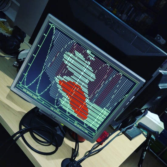
How Bad Is The Rain?
This variant of the radar is colour coded based on rainfall observed (rather than rain rate) so I could grab the RGBA codes using the colour dropper in the MSPaint window I and then realise I only give a shit about two values:
- No rain detected: 255, 255, 255, 0,
- Light rain detected (0.2mm): 127, 254, 255, 255.
Anything else I could classify as heavy rain because we’re only talking five minute intervals for a city only had greater than 10mm of rainfall on 17 days last year and a dashboard that’s mostly being used to make sure I don’t ruin my mohawk walking to work.
How Do I See It?
So I’d already created a dashboard monitor that displays graphs in a terminal interface using plotext and I don’t want to build a whole new thing even if I wasn’t using it for PC monitoring anymore. Plus I still want to keep the two sine waves oscillating at different frequencies because they’re cool and maybe add some other overlaid graphs.
So for low and high rain I convert the image slice (a 2D-array of colour codes) into two arrays: one each for x and y values of the relevant pixels.
Because of how PIL and NumPy read the arrays vs how a graph plots on axes I had to invert the y array (so the max value of the section subtract the actual value) so I didn’t display the data upside down. Then I just input that as a scatterplot, making sure that the graph would still go out to 80 values so the scale doesn’t shrink when there’s no rain out East.
plot.scatter(low[0], low[1], marker = "sd", color = "green+", fillx=80)
plot.scatter(high[0], high[1], marker = "sd", color = "red+", fillx=80)
How Do I See Direction?
Oh yeah, the great thing about the BoM rain radar is that looping animation so I know if rain is coming or going! D’oh.
I don’t really want a looping animation like the BoM site, I just want to see current rain and be able to infer it’s passage, so let’s grab the three previous images and do the same thing, using duller colours and smaller symbols:
for i in reversed(range(0, 2)):
    data_low = rain[i][0]
    data_high = rain[i][0]
    plot.scatter(data_low[0], data_low[1], marker = "dot", color = "green", fillx=80)
    plot.scatter(data_high[0], data_high[1], marker = "dot", color = "red", fillx=80)
That section goes above the latest image display and you’ll notice I iterate through so that the visible graph plots the most recent data on top (in case multiple sets have values on the same pixel coordinates).
How Do I Get Updates?
This entire project came about because BoM doesn’t have an API. There is no easy endpoint I can hit to see if there are new images. What I did notice was the radar images all have timestamps in the filename so in my update loop I check the time and if it was 7 minutes past a an image interval I make a request to what the new image would be named. If that fails I back off and check again in a minute and reset that minute counter once I get a 200 response because the data may get delayed due to processing and so it’s not exact.
Below is an example of how you could implement that:
from datetime import datetime, timedelta
from pytz import timezone
import time

rain_radar_delay = 7
while:
    if (gmt.minute + rain_radar_delay) % 60 < now.minute:
        gmt = datetime.now(timezone('UTC'))
        min_mod = gmt.minute % 5
        gmt = gmt - timedelta(minutes=min_mod)
        try:
            latest = get_image(gmt.strftime("%Y%m%d%H%M"))
            plot = extract_scatter(latest) # extract_scatter() where you turn image to scatterplot arrays
            rain_plot.append(plot)
            del rain_plot[0]
            rain_radar_delay = 7
        except:
            rain_radar_delay += 1
    plot_graph(rain_plot) # plot_graph() where we run plotext
    time.sleep(1.5)

def get_image(time: str):
    url = f"http://www.bom.gov.au/radar/IDR70A.T.{time}.png" # 5 Min
    response = requests.get(url, headers={
        "Referer": "http://www.bom.gov.au/products/IDR70A.loop.shtml",
        "User-Agent": "Mozilla/5.0 (Windows NT 10.0; Win64; x64; rv:140.0) Gecko/20100101 Firefox/140.0",
    })
    if response.status_code != 200:
        raise Exception("Not successful code.")
Once I’ve grabbed the latest image and extracted the scatterplot, I just append it to my array of plot data and then delete the first element (the oldest plot).
Final Notes On Project
This was a lot of fun to muck around with and has been super handy for us. It’s great being able to see the data we want in a format and design we like that meshes nicely with our interior styling. The reason I don’t go out and buy an IoT weather display that grabs data from a commercial provider is:
- I don’t want to buy a new single purpose device, I already had that monitor laying around.
- We want full control over the look and feel.
- IoT security sucks and I’d rather have some control over what’s in my home.
- If the provider cuts off data supply such a device is now a paperweight.
- I can add other non-weather feeds.
- I can copy the data to a database so I can use it in other dashboards.
- Commercial providers, especially global ones, aren’t nearly as accurate for local weather.
Not saying this is something everyone should have or build, but this is something that we get great utility out of, something that looks perfect with our goth-witch-tech decor. And I think if this kind of government data was made available in more accessible formats with better documentation we’d see more creative uses and we’d be working towards a culture that encourages people to experiment, create and interact with it in ways that works for them.
Notes On The Bureau
All the stuff about my project is above, this is some colour reading about the Bureau Of Meterology; some clarifications where I’ve made statements about their data, some criticisms of the organisation, and some warnings. Only read on if that interests you.
Preface
The BoM provides a bunch of great services beyond just observations, forecasts, and warnings. They have a massive network of observation stations that have been collecting data, some for over a hundred years, often in places that can be thousands of kilometres from population centres. These enable us to track and understand the impacts of climate change, to provide better forecasting and prediction of fire seasons, UV ratings (important for a country with the highest rates of skin cancer), agricultural management, etc.
On top of that, they use the ACCESS forecasting model that they built (refined from the UK Met’s model) to be more accurate and tailored to our region in order to provide gridded forecasts at 12.5km-33km resolution across this entire sunburnt land - forecasts for every 6-hour intervals out to 10 days. A model so complex they need their own funky little supercomputer to handle it, but a system that is so crucially useful to emergency services, public safety, and all our primary industries.
I’m adding the preface here because the BoM is an incredibly important department and one that we need to ensure continues operation even if we have absolute fuckwits want to roll back our net zero commitments, when we have repeatedly elected dickheads who don’t believe in climate change, and accuse the BoM of tampering with data. We can’t rely on other governments' meterology departments because their global models rely on our data in a reciprocal fashion (and also aren’t as accurate for our region). We can’t rely on commercial providers because most of them just repackage BoM data and the few that don’t have neither the coverage nor forecasting in Australia as well as not having transparency/accountability.
BUT.
The BoM is also a fucking shitshow.
No API
The BoM doesn’t provide an API to download data. There is some undocumented functionality from some BoM pages where you can force it to provide the data in something better for processing (XML/JSON) instead of HTML. If you want info and examples hit me up.
The thing is, BoM does actually provide free access to useful data, just in an unconventional ‘retro-cool’ fashion. They have an FTP server (in The Year Of Our Lord 2025) where you can download any of their public products. In fact, if you go to /anon/gen/radar/ and /anon/gen/radar_transparencies/ you’ll find all those files I used in the project! I’ve used a bunch of their other data in various jobs and projects over the years and it’s useful, albeit annoying to add in a bunch of FTP handling libraries for one data source. And I don’t want people to think I’m dissing FTP because it’s not hip and they should be using GraphQL or Protobuf or an LLM interface. I’m dissing FTP because it’s another damning indictment of their lack of care about security or infrastructure.
Work on implementing actual open standards APIs with proper documentation would make it accessible to a lot more people. Data could be requested based on actual schemas and not a byzantine list of product numbers under weird folder structures. Queries could be limited based on submitted locations or timeframes. Existing data that is currently only available as a web page styled after the hottest design trends of 2004 could be accessed easily through such a system and you could query historical data without having to remember each station identification number and then get annoyed because the form keeps resetting the metric or time period I requested.
FTP In(fo)security
FTP is an inherently insecure protocol with no encryption. So it’s inherently vulnerable to MitM attacks where an attacker can read or change data on the fly. Now if I’m accessing an anonymous public FTP server that everyone has access too and which only provides client data than does it matter if someone is reading it? From a security and privacy standpoint: yes. But to forestall dismissive rebuttals I want to point out that manipulation is a lot more insidious here. Rewriting transferred data isn’t just about editing the precis to say “over 9000 degrees tomorrow in Buttsville, NSW” but being able to run injection attacks on XML processing, tarpitting or, sending a never-ending amount of data4. Given the BoM is also fond of providing so many datasets in neat little zips it creates a wonderful opportunity for an attacker on the path to generate zip BoMbs.
And what about the restricted FTP products? BoM also provides a trove of products for government departments, businesses, and researchers that cost a screaming fortune but are thankfully all protected by a username and password. Except that because FTP isn’t encrypted anyone surfing the same wires gets free access and still the same option to manipulate the data. Considering the two protocols that are just “please encrypt your FTP traffic” (SFTP and FTPS) are both old enough to have voted in the past three federal elections it’s pretty poor form but also; par for course.
Regular In(fo)security
But surely this only affects a bunch of bloody nerds doing weird stuff, not average John Smith checking the forecast! Except (again, in The Year Of Our Lord Twenty Twenty Five) the BoM also not support HTTPS. This is pretty fucked in an era where over 80% of all web pages are viewed over HTTPS, where organisations like Let’s Encrypt provide free certificates, the ACME protocol allows for automatic verification and issuance of new certs, and where the Australian Cyber Security Centre says all businesses and government departments must use encryption for even non-classified data over a network[1][2] and even provide provides a handy guide explaining TLS and how to set it up. In fact, HTTPS is so prevalent that the campaign and extension “HTTPS Everywhere” is discontinued because of how ubiquitous it is. Hell, the first time you visit the BoM website on a new browser you’ll get hit with a redirect from Akamai because your browser defaults to HTTPS and you get knocked back. Somehow BoM has created it’s own funky new counter-culture in defiance of HTTP Strict-Transport-Security (HSTS) by forcibly downgrading you.
And maybe I’m making a mountain out of a molehill about how dangerous these flaws are or maybe that absolutely endemic lack of cyber fucks given by the BoM is why they ended up getting so thoroughly pwned by nation state actors. And this is where the issue comes to a head because the BoM was not the target of this attack, they were just the vector thanks to a government that doesn’t give a shit about IT. Because many other government-affiliated groups rely on BoM data there are reciprocal access paths betwen BoM and those who need weather data and may have valuable shit to steal such as Airservices, Geoscience Australia, Defence, Border Farce, and the Australian Federal Police5, plus various state agencies.
Attitude To Users
The fact that they charge access to a whole bunch of FTP products is crappy for a number of reasons. Firstly, most of that data isn’t sensitive - otherwise you wouldn’t be putting it behind FTP - and therefore it should be free and publicly available like the rest. The BoM is just digging its heels in obstinately against the government’s Open Data directives. Secondly, the fees being charged are bloody outrageous. It costs nearly $3000 to have them set you up an account with no access, plus $1220 every 12 months to keep your empty account. According to the BoM that’s how much it costs them to set you up with an FTP login and check every year that it’s still there. Of course, that account has nothing without subscribing to products which range from a cheap $174/year for a text file with seven day forecasts for one (1) state up to $36,291/year for the ACCESS-S forecast data. I would absolutely love access to the georeferenced NetCDF radar data but I’m not sure I can shell out $7000/year unless they can also guarantee me a reacharound.
I once started trying to get a registered account for a work project and this is my third beef; it took three weeks of back and forth emails2 before I got an invoice that obvs I couldn’t pay by credit card. This feels like the perfect opportunity for a self-service portal so I’m hoping that by the year 2035 they’ll have all the fahncy modern technology like BPay ready so they can start adding such a system.
The End Game
Almost anyone I know who is adjacent to the BoM has warned me off applying for roles there because of how dysfunctional and terrible the departmental culture is, mostly from the higher levels but that is something that filters down. The role of providing actual meterological services and the infrastructure to do so is undervalued and performed by people without agency or support. But in the long run, if the department can’t pull its head in they open up an easy avenue for the government to say it’s more proof that doing technology internally is a waste of taxpayers' money and use it as an excuse to give four times their budget to an external consultancy who’ll do it properly like:
- IBM with the 2016 Census,
- Accenture with the Department Of Health And Aged Care’s GPMS,
- IBM with Queensland Health’s payroll system,
- Deloitte with Defence’s myClearance system,
- KPMG with the One Defence Data project,
- Deloitte with DWER’s report on automated welfare compliance systems.
- And so many other projects.6
Australian government needs good ICT and that means staff, funding, and an internal drive for innovation. It needs capable internal systems administrators and developers and project managers all who can provide (and are empowered to provide) that internal assistance and momentum. There will always be stuff that needs to be outsourced but those staff are vital to stopping the Big Four from forcing vendor lock-in and generating shareholder value at the expense of the taxpayer.
Final Note
In the course of writing this I discovered that BoM also offers those radar images as a paid subscription in their Registered FTP Service for the low, introductory price of $3695 ($2266/year thereafter). So hopefully this will be useful to someone.
Update 2025-09-01
I’ve added an extra link in The End Game covering the news that Deloitte likely used AI to generate a report it charged the taxpayer $439,000 to produce.
I was also informed of the $866mil “ROBUST” technology transformation project BoM undertook. Searching for “BoM ROBUST” provides a link to their media release that doesn’t work. Thankfully you can find an archive of the BoM media release on Trove where you discover that part of the program was to provide “a new, secure and resilient Bureau website”. This would explain why the media release link didn’t work: it’s from their not-yet-released, still-in-beta website. I mean at least it has TLS but how much of our money did they piss against the wall on consultants that couldn’t even migrate the history from the old CMS to the new one? If the program finished mid-2024 how come this new website still isn’t the default? How come there’s still no APIs and outrageous data costs? Why do their new media releases read like AI generated SEO slop?
-
Off topic but as an itinerant digital hoarder I managed to dredge up an emails from 2010 when I asked in their feedback form if they would be able to add support for
bom.gov.auinstead of them only having an A record forwww.bom.gov.au. I received a reply that between 10mil hits a day, dual load balancers, etc, it was not an easy task. Understandable response given how underfunded govt IT commonly was but ending the email with “Meanwhile, I trust the extra 4 keystrokes aren’t too taxing…” felt like a dickish and unnecessary sign-off. To their credit, I received an email a year later that thanked me for my patience and announced that access viabom.gov.auwas now possible. ↩︎ -
Or I guess if your only tool is a hammer you’ll treat everything as a nail? ↩︎
-
Techniques that can be used for good if you want to fuck AI crawlers on your site. ↩︎
-
A federal department that was created for one purpose: to stop people throwing eggs at the prime minister. ↩︎
-
Okay I’m going to stop going through AusTender contract amendments and ANAO reports before it convinces me to go for a doctorate in mathematics and move to a log cabin to write “Consultancy Society and Its Future”. ↩︎