Last month I posted about being absolutely stoked with my new monitor setup and the remaining monitor that couldn’t be connected to my PC finally has a purpose. For a while now I’ve wanted a cool monitor just displaying a constant feed of information, but without the aesthetics of modern dashboards. To be honest I really wanted something that had that an old-school terminal effect and now it’s finally starting to come together.
The project leans upon the work I did in the lights on my flight switch panel, using InfluxDB and Telegraf to collect and store information about my computer.
The monitor itself plugs into a Raspberry Pi I had which is logged in and just runs a simple script using the plotext Python library. The code to run it is pretty basic, you start by setting up the imports and InfluxDB API:
import plotext as plt
import influxdb_client
import time

bucket = "home"
org = "Home"
token = "XXXXXXXXXXXXX"
url="http://influxdb.example.com"

client = influxdb_client.InfluxDBClient(
   url=url,
   token=token,
   org=org
)
Then we set up both of the queries we’ll use:
query_api = client.query_api()
query_gpu = '''
from(bucket: "home")
  |> range(start: -3h)
  |> filter(fn: (r) => r["_measurement"] == "nvidia_smi" and r["_field"] == "temperature_gpu")
  |> group(columns: ["field"], mode: "by")
  |> aggregateWindow(every: 15s, fn: mean, createEmpty: true)
  |> tail(n: 200)
  |> yield(name: "mean")
'''
The difference from the previous setup I used for GPU temps is that we use the aggregateWindow function to bucket the results to every 15 second interval and create empty placeholders if records are missed.
Next we setup the graphs and enter an infinite loop, refreshing roughly every two seconds:
sin_phase = 0
cos_phase = 0
while True:
gpu_result = query_api.query(org=org, query=query_gpu)
if len(gpu_result) == 0:
gpu_result = []
else:
gpu_result = list(map(lambda r: r.get_value(), gpu_result[0]))
if gpu_result.count(None) is len(gpu_result):
gpu_result = []
plt.clt()
plt.clf()
plt.theme('matrix')
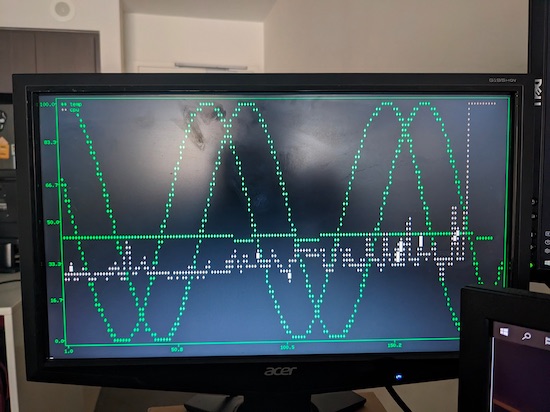
sin = list(map(lambda x: (x + 1) * 50, plt.sin(periods=2.5, phase=sin_phase)))
plt.plot(sin, color=(0, 255, 0))
cos = list(map(lambda x: ((x * -1) + 1) * 50, plt.sin(periods=2.5, phase=cos_phase)))
plt.plot(cos, color=(0, 255, 0))
if gpu_result != []:
plt.plot(gpu_result, label = "temp", color=47)
plt.show()
sin_phase += 0.025
cos_phase += 0.0125
time.sleep(1.5)
This will chart the GPU temperature from 0 to 100 degrees Celsius. You’ll notice this is also designed to handle when there are no records returned by the InfluxDB query to prevent it crashing when trying to draw graphs without records. It’ll also draw two sine waves that refresh at slightly different phases creating a cool changing pattern that gives more interest to the graph.
On my personal version I’ve also updated it with a CPU monitor (the grey line in the image above) and plan to keep adding functions as I require.